Work experience
Unifying subscription data
An overhaul of the billing functionality within the internal admin desktop application, aimed at helping internal teams manage customer subscription billing and renewals more effectively.

Key information
Project overview
Team
2 Product Managers, 3 Full-stack developers, 1 UX designer
Timeframe
3 weeks for design and iterations
Defining the problem
Eliminating unreliable and conflicting subscription data

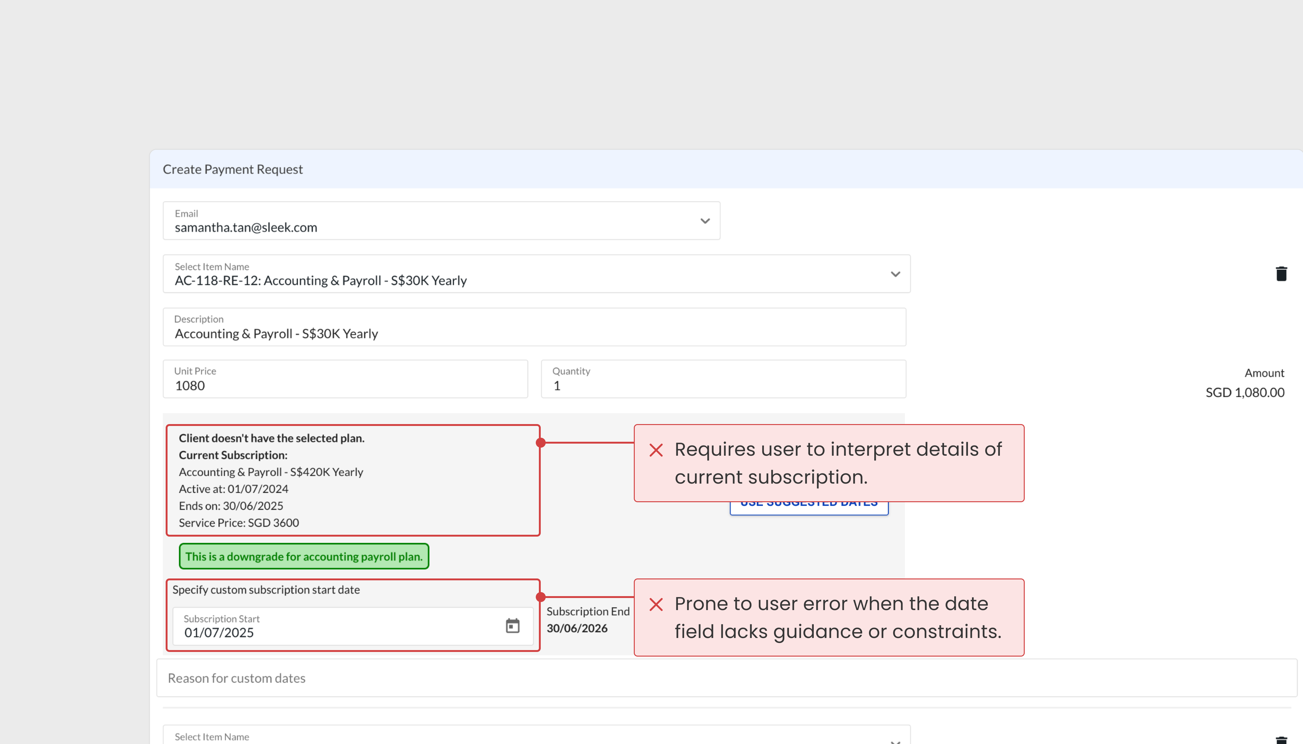
Disconnected subscriptions
Subscriptions were not linked and made it difficult to see a client’s subscription history or changes over time.
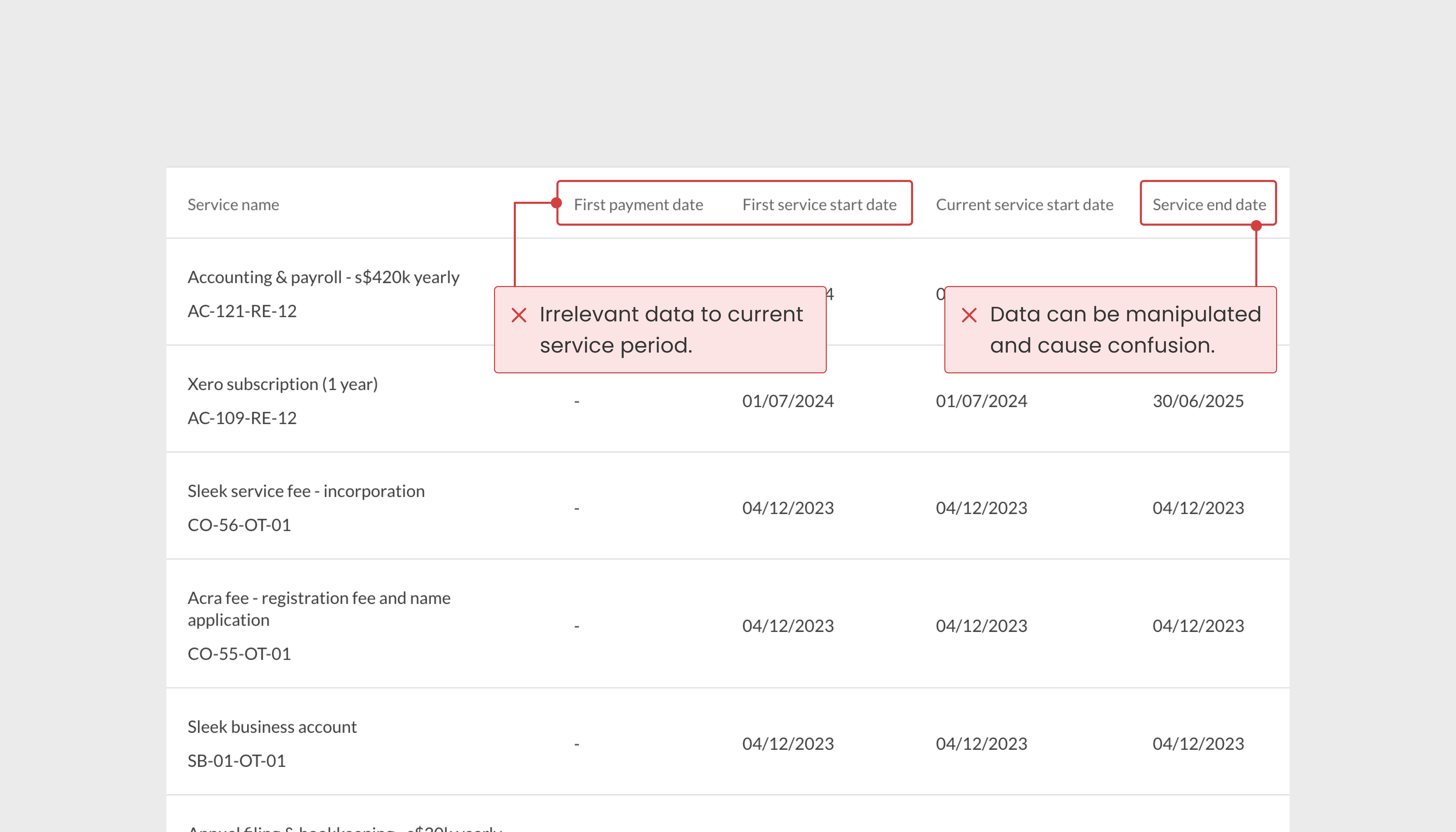
Data integrity issues
Subscription end and renewal due dates could be manually edited by multiple users. This led to unreliable data and confusion around subscription timelines.

How might we improve coordination across service billing and delivery to better manage customer subscriptions?
Understanding the impact
Impact on service delivery and renewals
Missed deadlines and inefficiencies
Inconsistent, unreliable subscription records made it difficult for teams to track service timelines, leading to coordination issues and delays in delivery.
Missed sales opportunities
Due to the lack of visibility into subscription activity, it was difficult for sales team members to identify timely opportunities for upgrades or renewals.
Designing a solution
Defining a new subscription structure
The product managers led initial discovery sessions with stakeholders and internal teams to define new billing logic and subscription rules. These improvements changed the way subscriptions are created, managed, and delivered.

Creation of subscriptions:
Prevent date entry errors
Key subscription dates are now auto-populated based on predefined rules, eliminating manual edits and reducing the risk of inconsistent or conflicting data.
Overview of subscriptions:
Separate date and status fields
Splitting subscription coverage and renewal due dates into separate fields gives each team a reliable point of reference for their specific needs.


Visibility into subscription details:
Unique subscription identifier
Assigned after payment, the subscription ID links each subscription to its invoice and company, and enables backend logic to connect related records.
Subscription billing: From overload to item-level clarity
Due to the number of subscriptions and variants available, the new interface aims to support internal users in accurately completing payment requests through progressive disclosure with active and inactive item states.

Subscription management: Reassessing key subscription details
Distilling data points that were most valuable to show upfront. The goal was to make the subscription information shown on the table table more immediately useful for internal teams handling delivery and renewals.

Visibility into subscriptions details: Grouping information data
Reorganising the subscription details page into a structured layout with three distinct groups:
- Delivery tracking
- Subscription-specific details
- Audit log for updates and linked subscriptions
This categorisation improves clarity and enables different internal user groups find the information they need more easily.

Next steps
Informal user feedback
With the rollout of the new billing structure, a dedicated Slack channel was created to support internal users. Requests and conversations are monitored to identify patterns in feedback or confusion that may signal opportunities for future UX improvements.